
Brand identity — 2026
Evrythn Digital
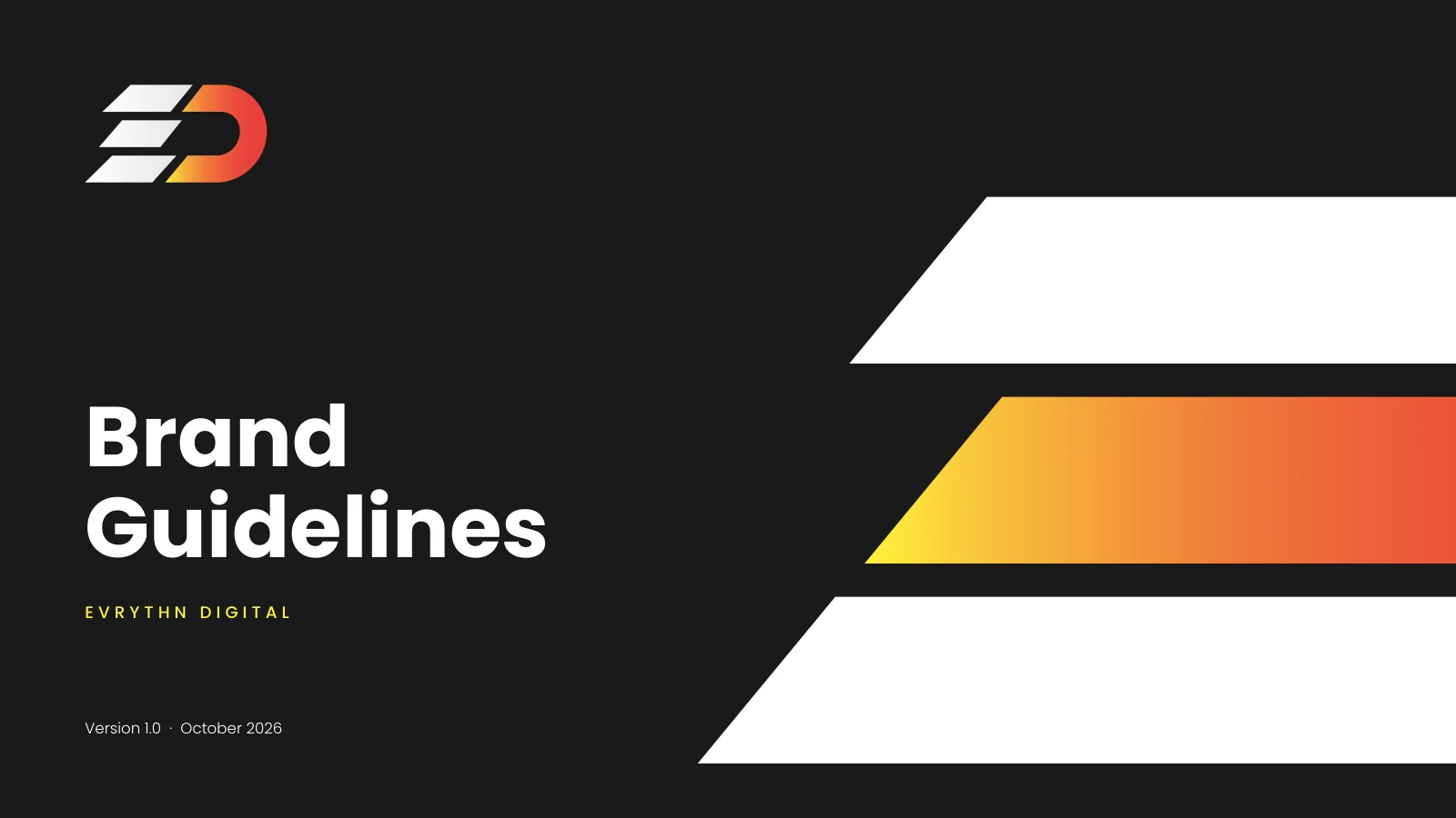
A brand built on momentum: flame gradients, a 50° slant and a mark that leans forward.
The project
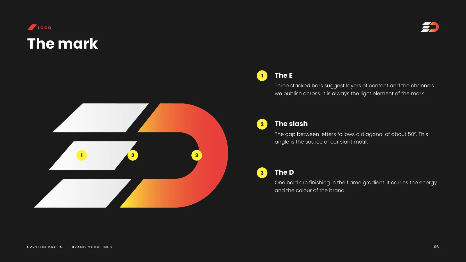
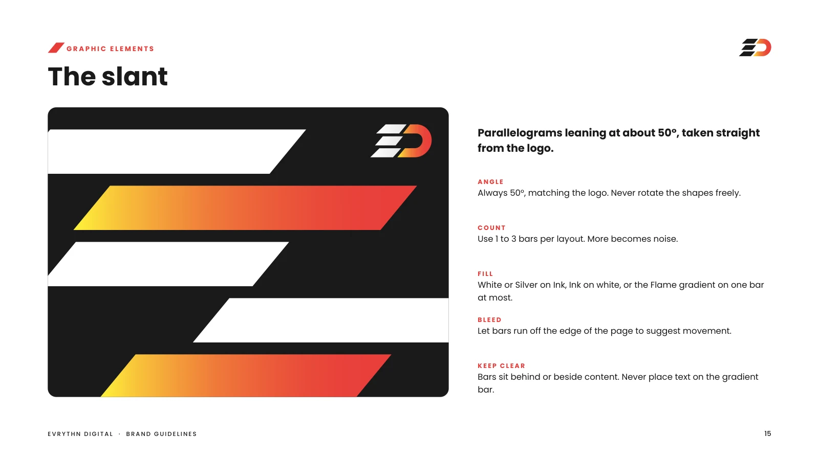
Evrythn Digital publishes across channels, so the identity had to work as a system rather than a single logo. The mark stacks three bars into an E and finishes in a flame-gradient D; the angle between them becomes the brand's slant motif.
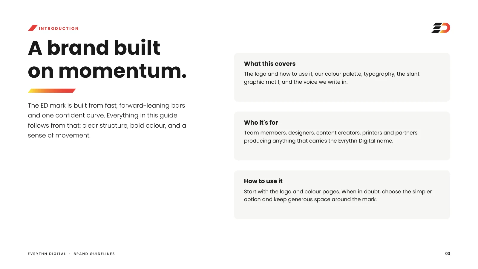
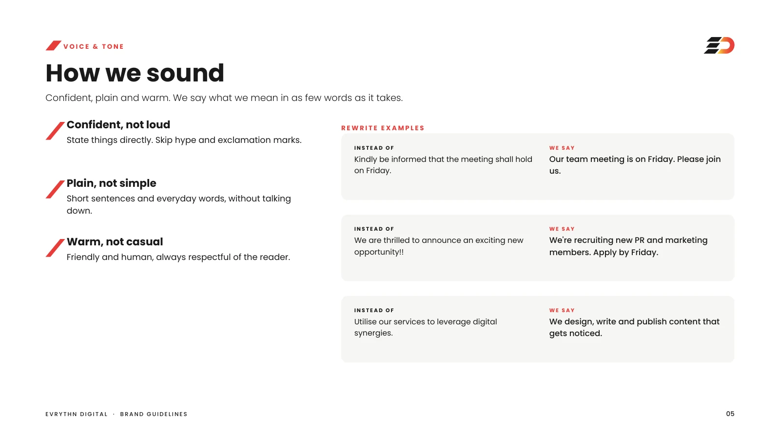
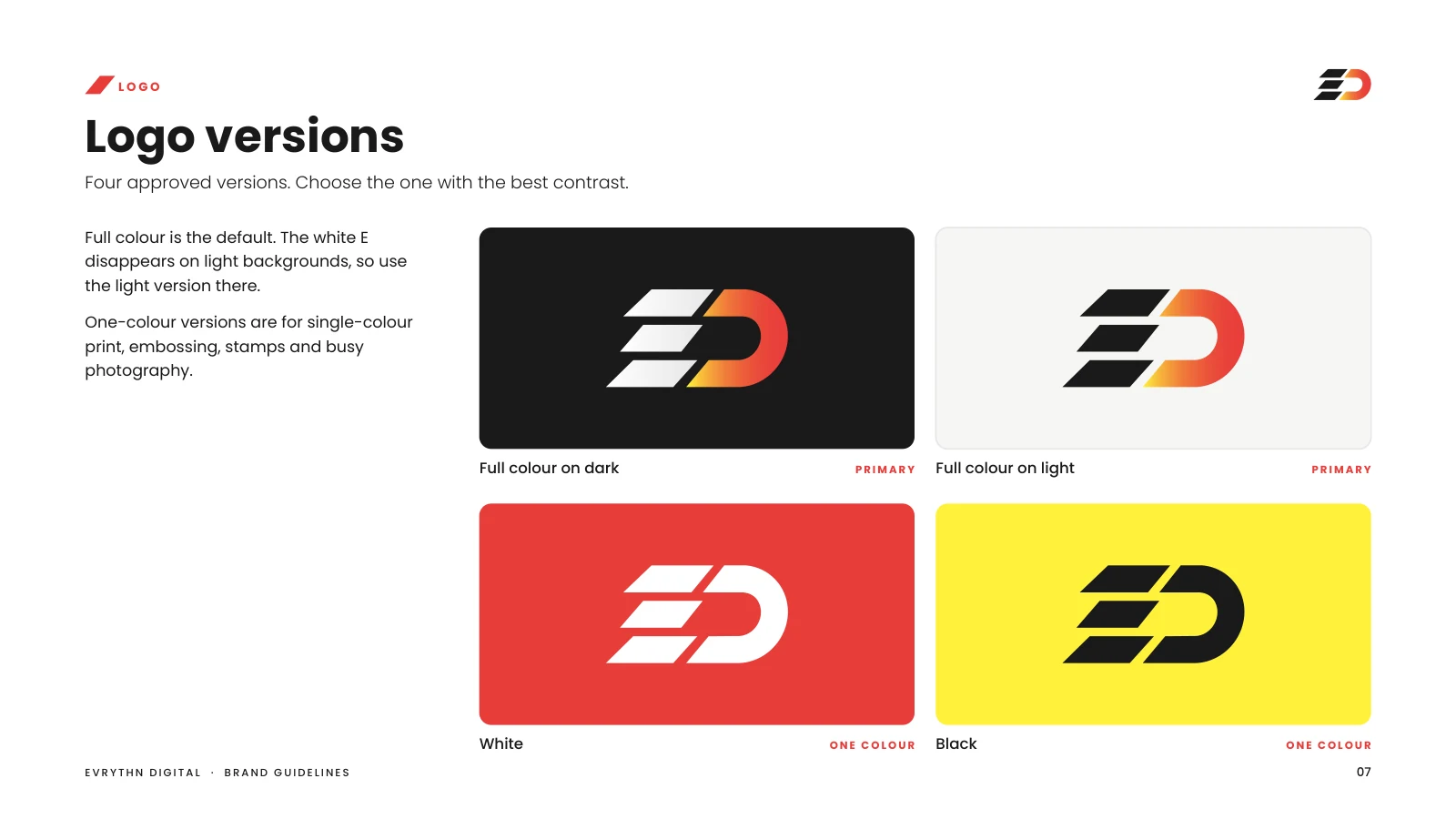
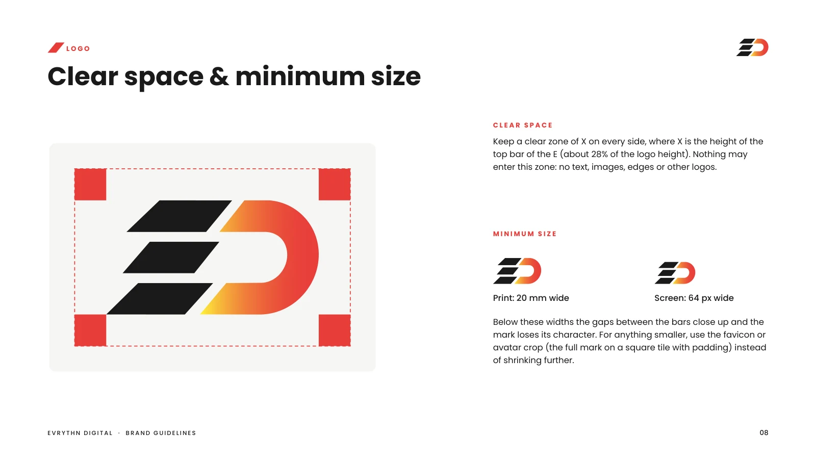
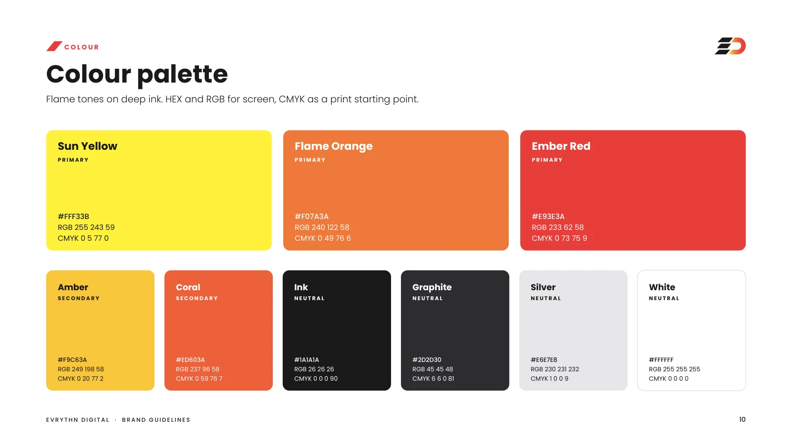
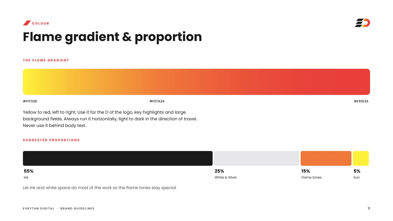
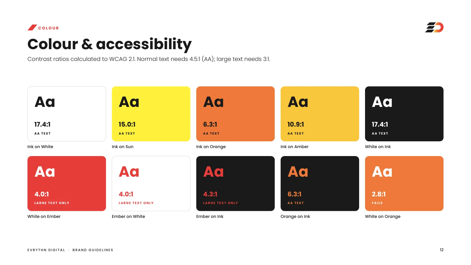
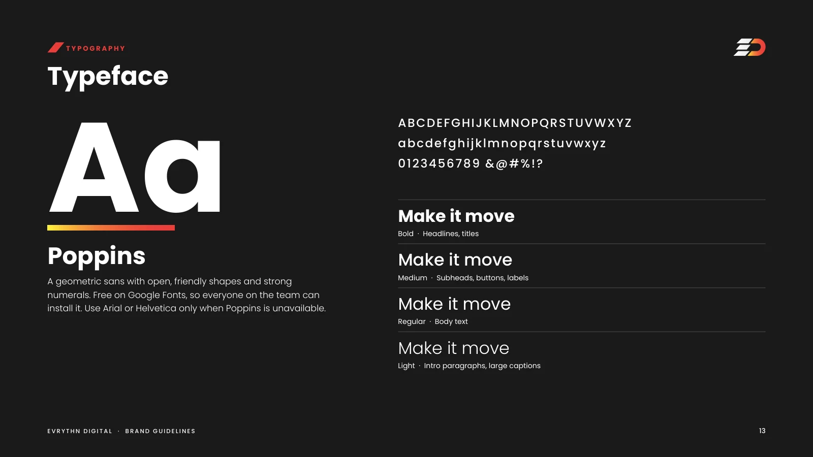
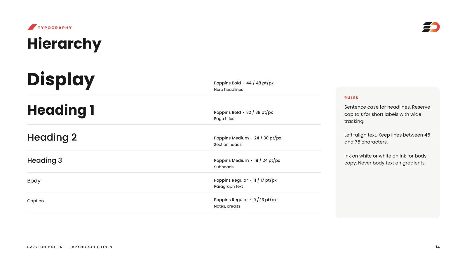
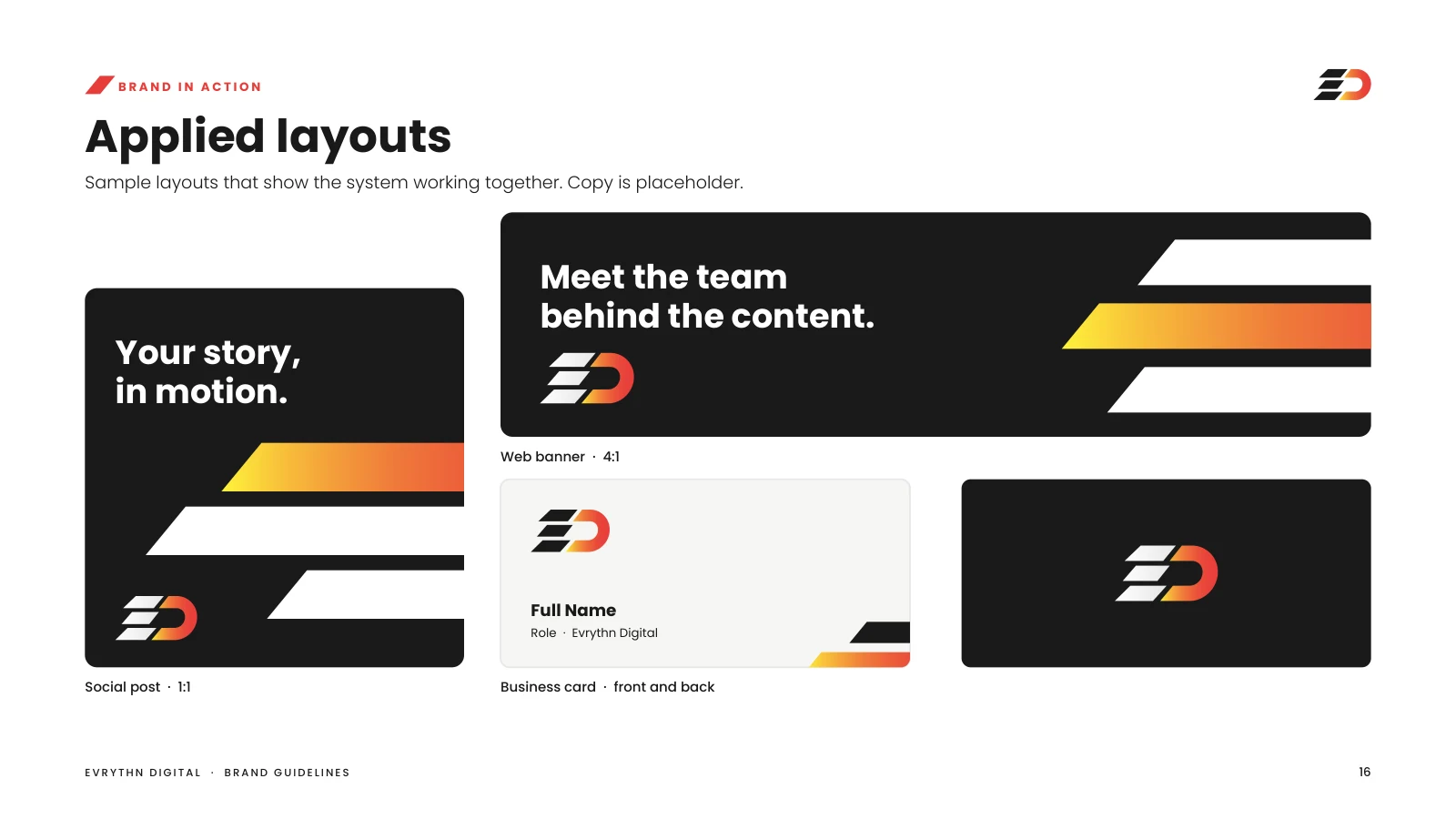
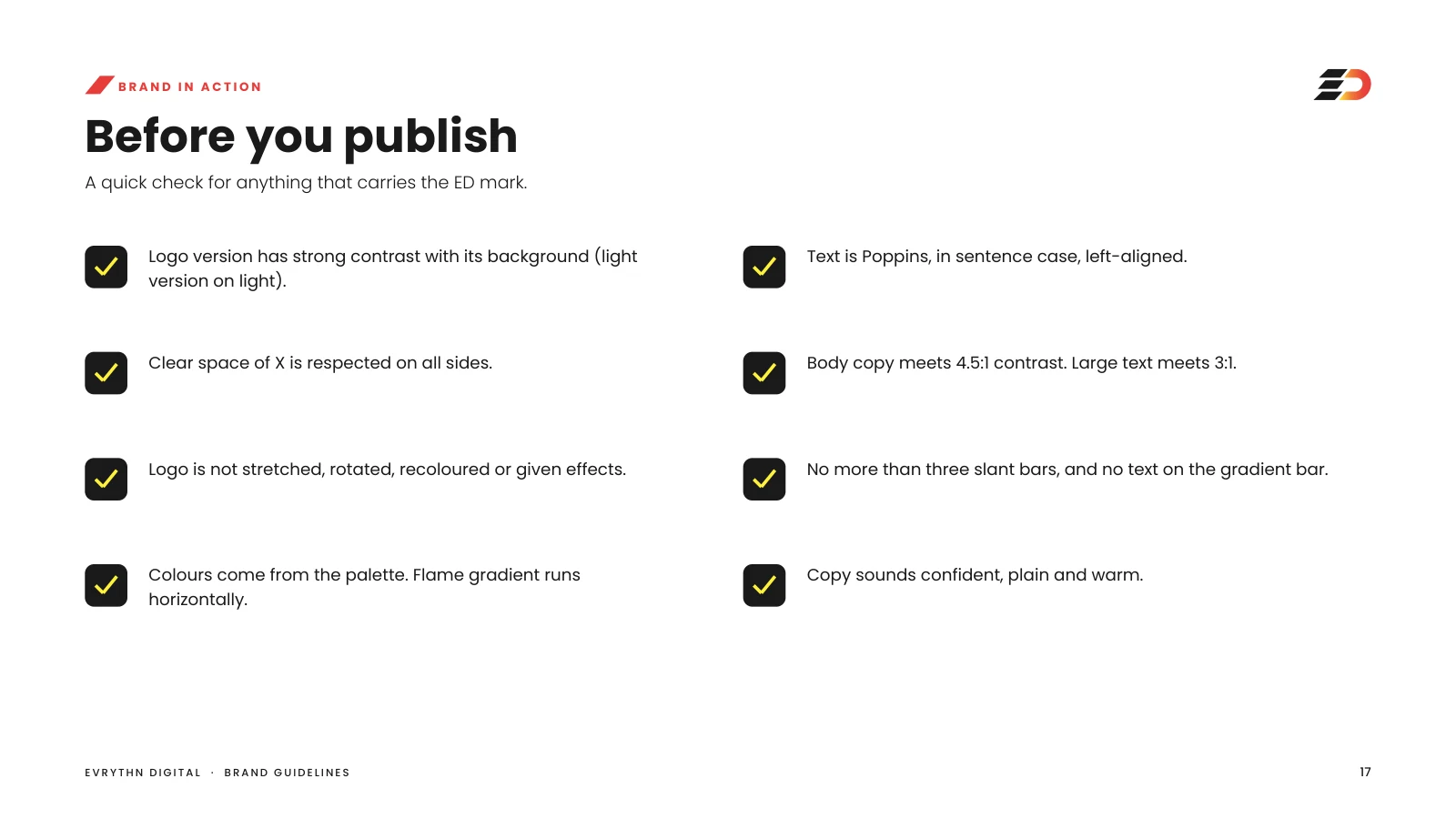
I developed the logo suite, colour and accessibility rules, Poppins type hierarchy, the slant graphic language and an 18-page playbook — including voice, application examples and a pre-publish checklist.
The full guide
Eighteen pages, page by page.
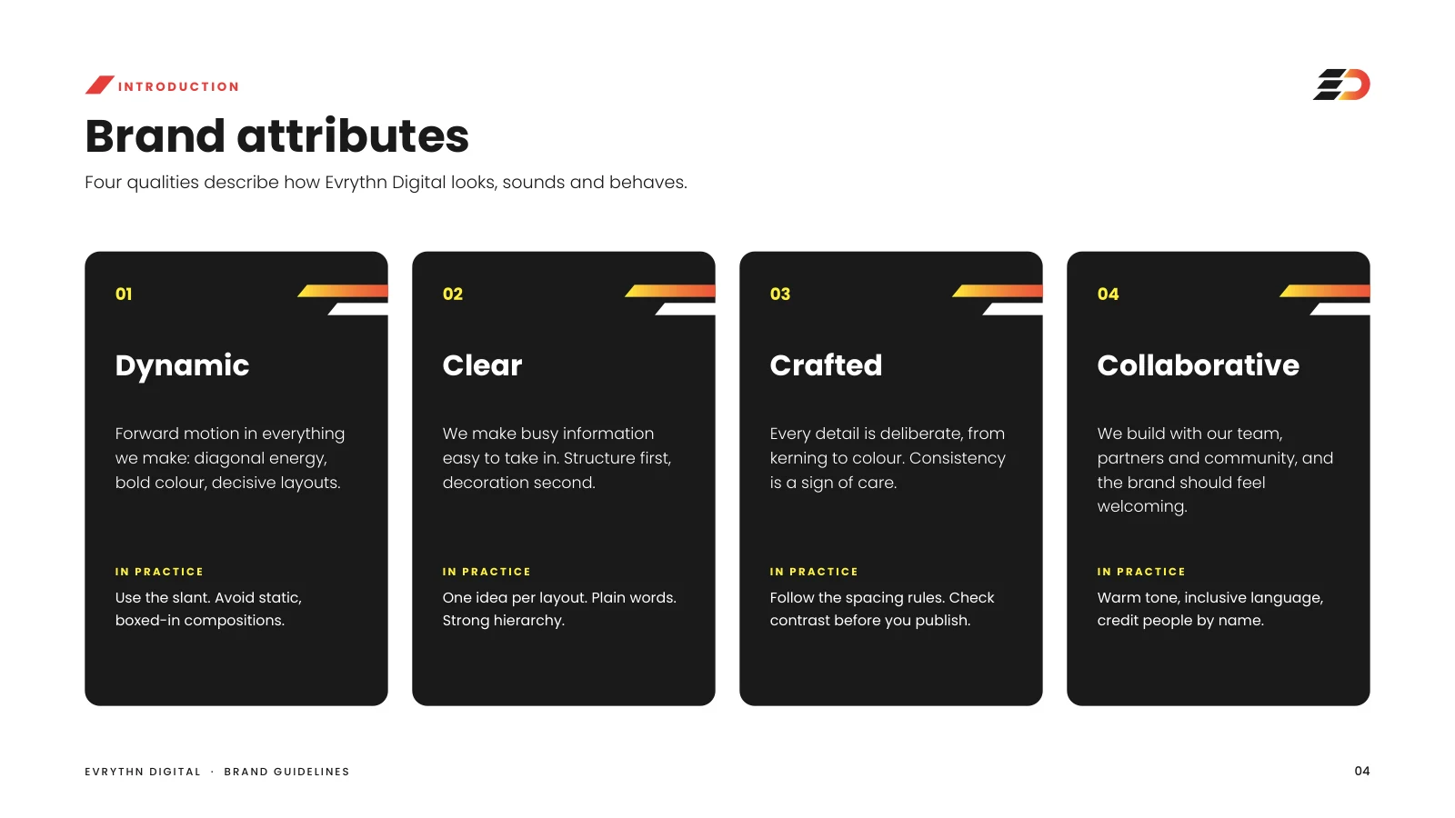
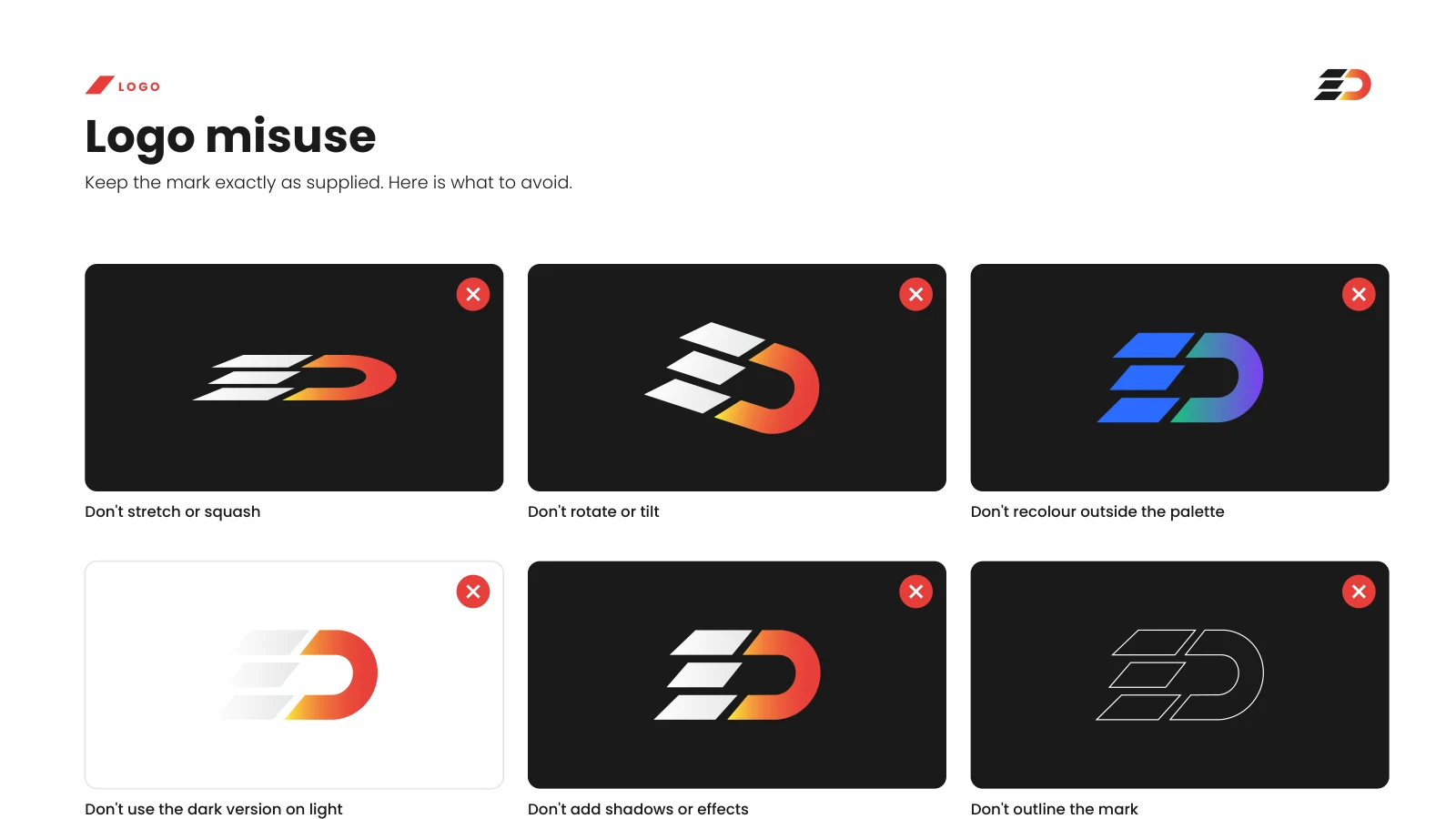
The complete Evrythn Digital playbook — logo suite, slant language, colour, type, voice, applications and the pre-publish checklist.
Click any page to open it at full size.
Next project
Aburi Botanical GardensStart something