
Brand identity — 2026
Aburi Botanical Gardens
A logo rationale that roots the Gardens in the Akuapem hills — and in Ghana's cocoa story.
The project
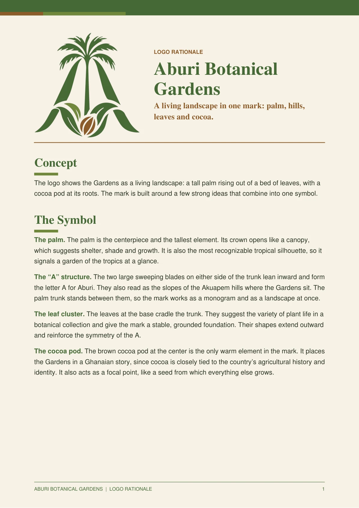
The mark had to work as an official emblem, a signage icon and a souvenir. I built it from a palm, two sweeping blades that form an A, a cradle of leaves and a single cocoa pod at the centre.
The rationale explains every decision — the A for Aburi and the Akuapem hills, the palm as canopy and shelter, the cocoa pod as the one warm note — alongside a deliberately small palette of deep green, fresh olive and earth brown.
The full guide
Two pages, one rationale.
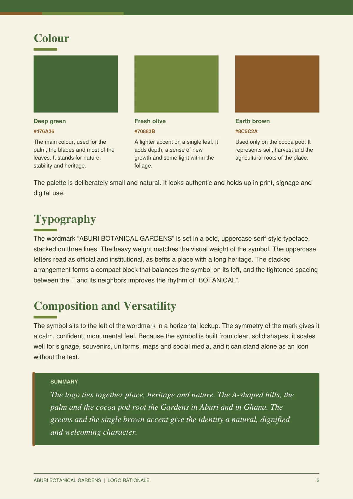
The complete Aburi Botanical Gardens logo rationale — the palm, the A structure, the leaf cluster and the cocoa pod, explained from first principles.
Click any page to open it at full size.
Next project
Sisters & SpiceStart something